Hello Simply Sassy fans!
It´s time for another tutorial thursday and today I am showing you how to add depth to a paper pieced image.
You´ll need:
*patterned paper
*ink pad
*stamp (I used Retail Therapy here)
*your favourite coloring medium
It´s time for another tutorial thursday and today I am showing you how to add depth to a paper pieced image.
You´ll need:
*patterned paper
*ink pad
*stamp (I used Retail Therapy here)
*your favourite coloring medium

Start with stamping your image on the cardstock you usually use for stamping/coloring and once on each of the different patterned papers you want to use. There´s no need to stamp the image twice, I just want to show you two different coloring mediums here.
I usually use Copics for coloring.
Pick the colors that match your paper best. Make sure to do a little testing on the paper since markers may look a bit different on the different papers. Doing a test will also give you the feeling how the color blends on the paper since this varies as well.
I picked some green patterend paper and started with YG-97 as the darkest color. Add just a little bit of color to the areas that will be the darkes on your image:

I then went on with YG-95:

YG-93 was the next color I used.
I did not cover as much of the dress as you would for a normal image since I want to see that it is paper pieced. The color I am adding is just for shading:

I picked YG-91 as my lightest color and added this with little strokes, that got lighter when I cam to the center of the image. So I am able to blend everything together but still don´t cover all the pattern on the paper:

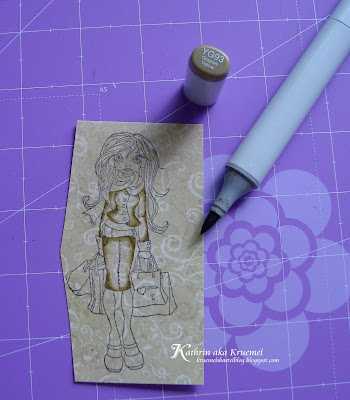
The next paper I picked was a light beige one. Here you can see how I tested different markers on the upper right corner until I found the combo that worked best for this paper.
I started with E-43 for the darkest areas:
I started with E-43 for the darkest areas:

...then went on with E-81:

...and finished with E-40:

The 3rd paper I wanted to use was off white with a very fine brown pattern. Usually the E-43 to E-40 would have been my first pick for this but since I used those colors already on the beige paper and I wanted this one to look different I went with some warm beige. I started with W-4:


Then I took the stamped image on the regular cardstock and colored those areas in that won´t be covered by patterned paper:

I cut out the shaded pieces of the patterned paper and glued them to the image on white cardstock (picture taken in the middle of the process):

You can do this shading also with Prismacolors. They will give a softer look.
Start with some green color, add it to the darkest areas and blend it towards the middle of the image/area:
Start with some green color, add it to the darkest areas and blend it towards the middle of the image/area:

Then use a black pencil and only add a little bit of color to the areas you want to be the darkest. Then carefully blend this as well. Take care to not blend it too wide towards the center:

And here you can see the difference between those both mediums. I´ve only done the green parts with Prismacolors but I guess you are able to compare those on the picture:

And these are all the Copics I used, including the ones I used for coloring the image on white cardstock:

Okay, and tomorrow morning I will share with you the card that I used that image on. Have a happy day!


Brilliant tutorial, thanks Kathrin. A real insigt into how you shade, I have noted the colour numbers to have a try!
ReplyDelete** Kate **
great idea, i never thought of shading on paper piecing x
ReplyDeleteThis gives such an amazing effect!! Brilliant tutorial Kathrin!!
ReplyDeletexo.
Amazing. Im going to have to try this. Thank you so much.
ReplyDeleteThis is FAB!!! I am definately gonna give this a go!!xx
ReplyDeleteWow fabulous tutorial
ReplyDeleteHugs Dianne xx :)
Awesome tutorial! Gotta go try that; and thanks for that comparison; almost makes me wanna take out my Prisma....but I am stuck to my Copics....LOL!
ReplyDeletethis is great!!!!!!
ReplyDeleteThanks for such detailed info & the Copics used - that's helping me understand the numbering/shading. The comparison with Prismacolor is so useful to see too (I love pencils). The greens are super & I look forward to seeing your completed card.
ReplyDeletePaula (PEP)
your illustrations are fabulous, I love them! so happy I found your sweet blog. Hugs
ReplyDeleteThis is a fabulous tutorial Kathrin! Thanks for sharing.
ReplyDeleteI think I just fainted !! This is soooo fantastic.. thank you for sharing this... must try it
ReplyDeleteHugs xxx
Wonderful Kathrin, thanks so much for sharing this great tut !!!
ReplyDeleteHugs, Sandra xx